 (c) Toni Klemm (c) Toni Klemm This post was originally written for the Early Career Climate Forum and posted in November 2014.
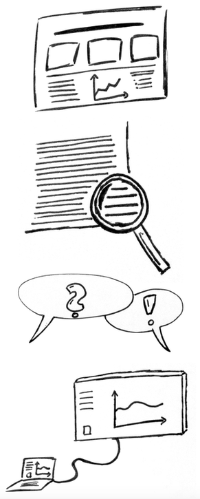
AGU comes in December, AMS in January, AAG in April – the next big conference is always around the corner – and so might your poster presentation. Here are a few tips for a killer poster that will rock the place. Figure this. Your poster is not a whole journal article printed on a large piece of paper. Avoid large pieces of text and use figures, tables, charts, diagrams, and captions – sort of a journal article but without the text. Use these visuals as aids when you’re explaining your research to someone. Also, check that colors go well together (pie charts, flow charts, bar graphs, illustrations, schema). They might look good on screen, but may be hard to read on print. Less is more. Don’t try to fit every aspect of your research onto the poster. Don’t state every little detail of you research, but focus on the main stuff, one major finding. Keep text short, maybe as bullet-pointed lists. Give people insights into your research hooks to ask follow-up questions. Proportions. Make sure your poster size meets the conference requirements and is not bigger than your allowed space. Test that your figures etc. look good from four or five feet away, that they’re not too small and not too big. Make a test print if necessary. Normal text should be in font sizes between 36 to 44 points, titles about twice that. Fonts. Don’t give your poster fancy fonts to stand out. It’s about the content, not (just) the looks. The rule of thumb is 2 to 3 different fonts, not more. Pick a serif font (e.g., Cambria, Georgia, Garamond, Times) for normal text and a sans-serif font (Arial, Helvetica, Impact, Gill Sans, Futura) for poster title, axes titles, captions etc. Serif fonts are better for flow text because their small “feet” form an imaginary line, making it easier for your eyes to follow the line of text. Sans serifs (sans is French for “without”) meanwhile are best for titles, subtitles, captions, and other shorter pieces of text. Bring business cards. This is a no-brainer, right? People might want to stay in contact with you, so business cards are a must-have. Also, sometimes posters can be left hanging after the poster sessions ended (and without you there). For those cases bring a little pouch (seek your inner Bastelkönig to make one) for your business cards and pin them next to your poster. Alternatively, put your contact info on the poster, or create a QR code with your contact details. QR codes are free to make online (links below), and there are plenty of free reader apps for smartphones. Say something. “What are you working on?” “What’s your research about?” If you hear this, your poster caught someone’s attention. Well done! Now you need a short yet compelling elevator speech. Give yourself 30 seconds to tell the beef of your research, but tell it in a way an 8-year-old child would understand it. Keep it simple and free of jargon or weird acronyms. Advanced level: Ask the person about his or her background and tailor your speech on the fly. A marine biologist might need a different explanation than a volcanologist. Electronic posters. It’s not very common, but every so often poster sessions use electronic posters (they’ll tell you ahead of times). This means you’ll have a big-screen TV to present on. This might sound odd but it’s actually great news for you. Use the screen to present a short (2 to 3 minutes) powerpoint presentation instead of just showing a static “poster”. Find out about the screen size, which ratio (4:3, 16:10, 16:9) and resolution (full-HD, HD) and format your slides accordingly to use the space in the best way possible. Bring monitor cable adapters and save your presentation in PDF format or the slides as JPEG files (Powerpoint and Keynote both let you do this), in case you have to use a computer provided by the conference host. Don’t assume your powerpoint slides will look the same on another computer. More advice on poster design: http://betterposters.blogspot.com (weekly critique of a sample poster) Colin Purrington: Designing Conference Posters Discussions on Poster’s Graphic Design Elements QR Codes Comments are closed.
|
 RSS Feed
